How to Activate Your Heat Vision Powers
Making Use of Python and Heatmaps in Your Data Analysis
When it comes to data visualization, keeping it simple is usually the right approach. Line and bar charts are great for most use-cases, they’re simple to create, patterns in the data are usually immediately apparent, and audiences at any level are familiar and comfortable with them. However, with their simplicity comes some limitations. One of the most common issues is that if you have too many bars or lines, the chart becomes an unreadable mess. You could split your chart up into multiple easier-to-read charts with subsets of the data, but in doing so you sacrifice the ability to see the whole picture at once. What’s a data analyst to do? In this case, we need to reach into our visualization toolkit and opt for a slightly more advanced type of chart: the heatmap.
Heatmaps are less common than bar and line charts, but they can strike the right balance between simple interpretation and depth of insights. The core concept of heatmaps is that as the intensity of your metric changes, so does the color on the visual. Audiences may be familiar with things like “heat vision” or “thermal imaging”, where we can actually see variations in temperature, and that’s exactly what a heatmap will do for our data. With that in mind, let’s explore a practical way to incorporate heatmaps into an analysis.
Case Study: Wossamotta University
Our friends at Wossamotta University* (Wossamotta U for short) have asked us for help in analyzing their Peabody Society. The Peabody Society is collection of donors who provide scholarship support for the History Department at Wossamotta U. This group was formed in 2009 and has grown naturally without really being a focus for the fundraising team until now. Fundraising leadership has recognized the potential for growth and wants the Peabody Society to become a major philanthropic group for the school.
*Wossamotta U is a fictional university whose most notable alumni are Rocky the Flying Squirrel and Bullwinkle J. Moose. As such, the data shown here is fictional, randomly generated and modeled to simulate real-world giving data.
They need our help to make sure that they can grow and expand the Peabody Society strategically. The first question they want answered is, “When do Peabody Society members give most often? Are there any patterns in the timing of their giving, or do they give equally at all points in the year?” If any giving behaviors have developed naturally, the university can capitalize on those existing habits and align the fundraising strategy accordingly.
We can quickly generate some answers in Python using just 3 libraries:
- pandas: The pandas library will allow us to work with and manipulate tabular/spreadsheet data like .xlsx and .csv files.
- Matplotlib: Matplotlib, and specifically the pyplot module within it, is a plotting library and is one of the most popular ways to visualize data in Python.
- seaborn: seaborn is another data visualization library for Python and is actually based on Matplotlib. However, using seaborn gives us more styling and formatting options to make our charts and visualizations more polished and ready for distribution. It might help to think of Matplotlib as Steve Urkell and seaborn as Stefan Urquelle. At their core, they’re the same, but one is much more stylish and suave.
This post isn’t meant to serve as an instruction guide for pandas, Matplotlib or seaborn, but rather how we can visually represent trends over time with these libraries. I’ve included links to their documentation which is very thorough and there are tons of other free resources online for learning the specifics of each library.
Data Preparation
We begin by importing our libraries, loading our data, and looking at the first five rows of our dataset with pandas’ .head( ) function. If you’re using a different coding environment, it’s not necessary.
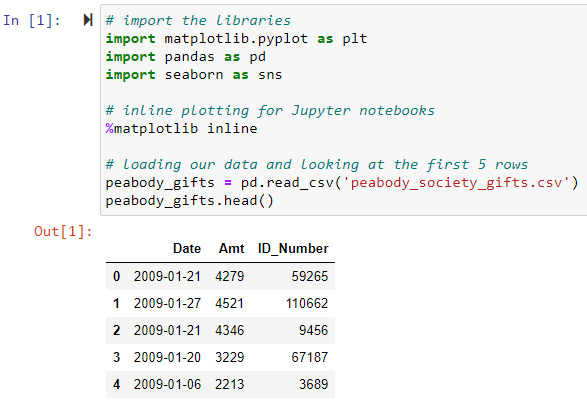
By convention, we store our libraries in variables called plt, pd , and sns but you could name your variables just about anything. Additionally, the %matplotlib inline call is just for use with the Jupyter Notebook editor interface. Looks like a pretty simple transaction file with 3 fields: Date, Amount and Donor ID. We can use the .info( ) function to get more details about this file.
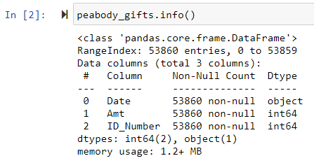
It looks like we have almost 54,000 transactions made by the Peabody Society members. We’ll have to address the dtype of our Date field. Currently, pandas is classifying our Date field as an “object” which is essentially a string of text. While you and I can recognize that this field represents a date, pandas did not. But that’s okay, we just have to tell pandas to convert those to a date. That way we can take advantage of pandas’ ability to extract the different elements of a date (day, month, year) to be able to analyze our data with more precision.
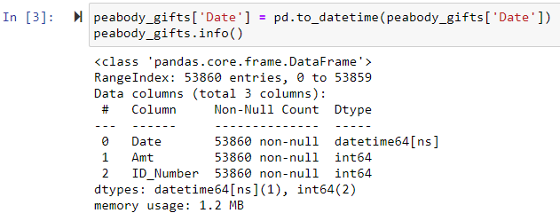
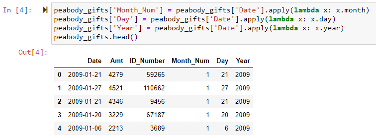
Now that it’s stored as an actual date, we can easily extract the day, month, and year as separate elements. We’ll create new columns for each element with some simple lambda functions.
Having the month stored as a number is good, but it would be easier if we had the actual name of the months. That way, we can avoid any confusion around between calendar year months or fiscal year months. We can set up a quick dictionary and use the .map( ) function to create another new column with the names of each month. Calling .sample(7) will randomly select 7 rows and show us their values.
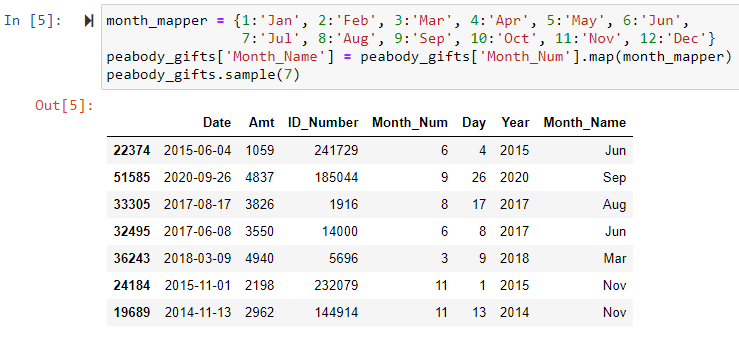
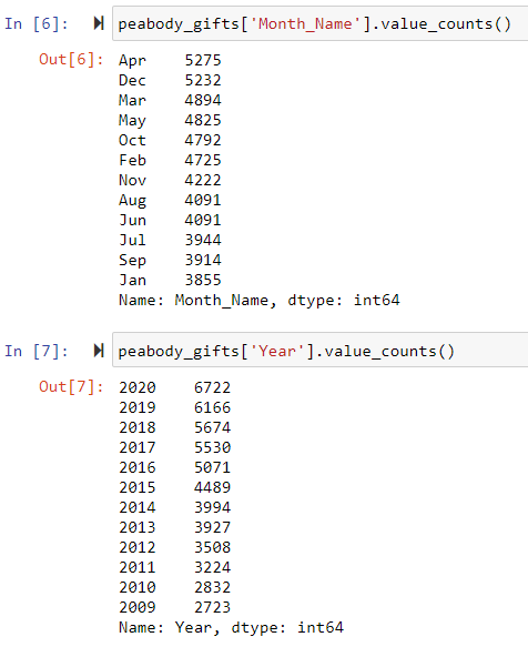
From here, we can do some quick checks to see how many gifts were made each month or year with pandas’ .value_counts( ) function. This function is a simple way to count how many values there are for each category.
While this information gives us some insight, it doesn’t give us any historical context. We can see that April and December are the top months, and that more gifts have come in recently than in earlier years. But the Peabody Society has been around since 2009, have April and December always been the big months? It would be better if we could see giving across both months and years at the same time.
Luckily, pandas has a .groupby( ) function so that we can group all transactions by the month and year in which they occurred. Then we just count up the gifts for each group, and using the .unstack( ) function, we end up with this nice matrix of months and years.
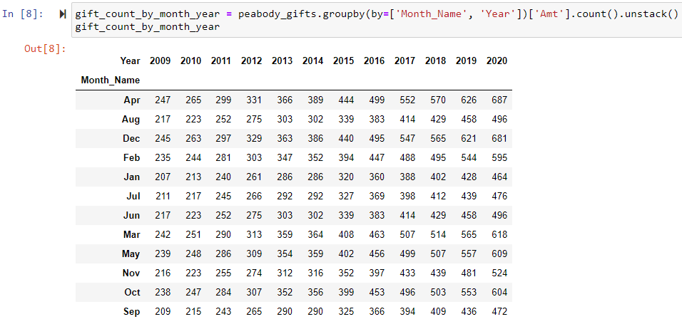
The only issue is that our months are sorted alphabetically rather than in their proper calendar order. Once we define the proper order, we can use .reindex( ) to shuffle the rows into the right order.
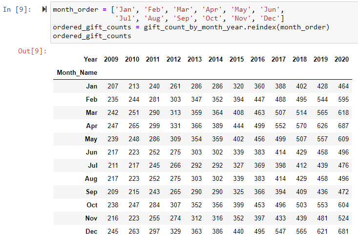
The only issue is that our months are sorted alphabetically rather than in their proper calendar order. Once we define the proper order, we can use .reindex( ) to shuffle the rows into the right order.
Line Charts
Usually, when measuring something over time, line charts are a great option, so let’s start there. The matrix above is in what’s known as “wide” format. While this is convenient for us to read and understand, plotting a line chart will be much easier with data that’s in a “long” format where each row is only a single observation, rather than a collection of observations. So first, we’ll re-group our data, but we won’t use the .unstack( ) function which is what gave us the “wide” layout earlier.

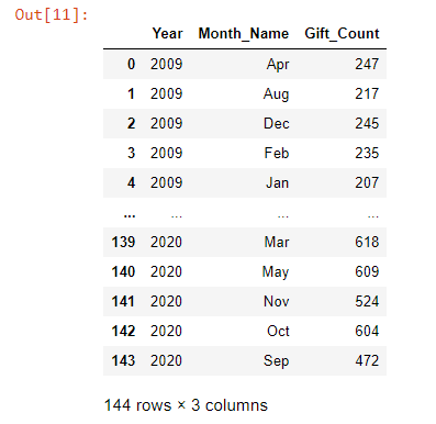
pandas’ .groupby( ) will default to returning data in this “long” format. Here we have each row representing a single month and year combination. In the “wide” format from above, each row represented a single month out of every year. The values are the exact same as before, but hopefully you can see how this configuration of the data is considered “long” compared to the “wide” matrix above.
Now that we have our data in a long format, we can plot our lines using seaborn’s .lineplot( ) function. Don’t worry too much about all the detail in the code shown below, it’s mostly formatting.
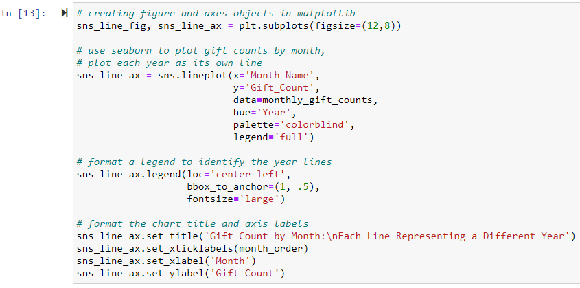
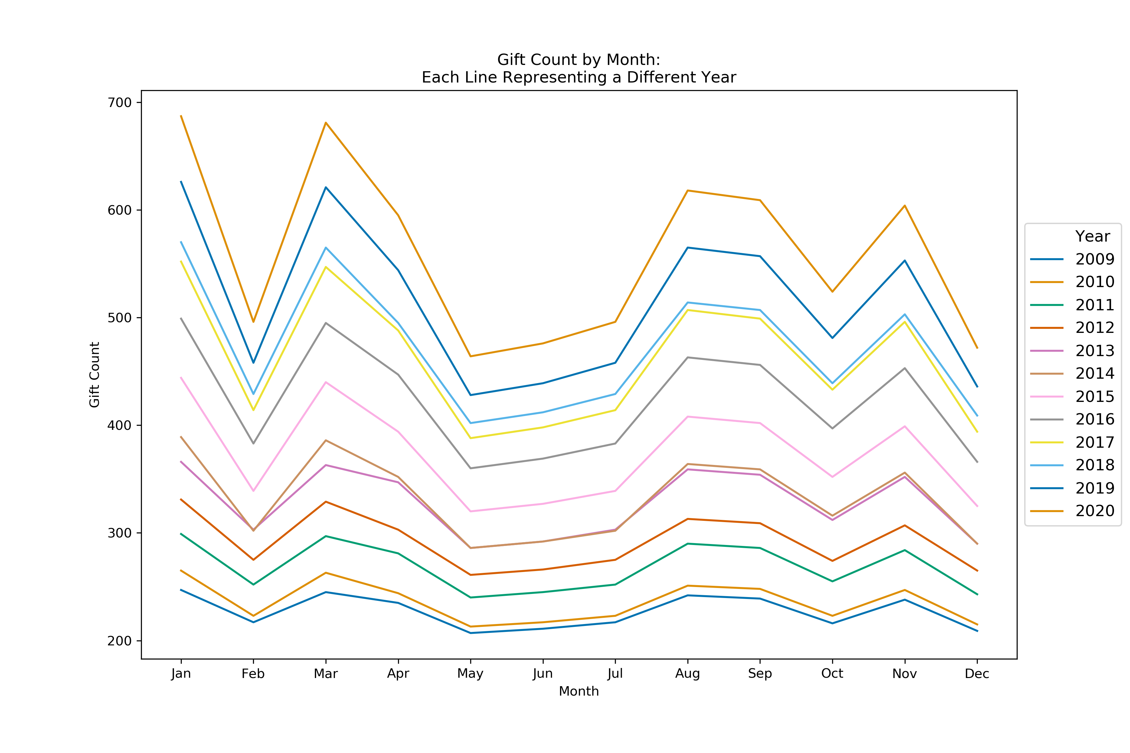
Woof! That chart is not great. The main issue is that we’re wanting to analyze the entire history of the Peabody Society, which started in 2009. We have 12 years of data, which is too many to try and color-code nicely. In general, you wouldn’t want to have more than 5 colors to distinguish groups. We could analyze the data by plotting one year at a time, but then we’d end up with 12 separate charts and we lose the ability to really see how things have changed over time. We can start to see some patterns with the months, but it’s still not very clear what to take away from this.
Maybe if we swap years and months it might be easier. The code for this second chart is essentially identical to the first, just swapping the x and hue parameters, so I won’t repeat it.
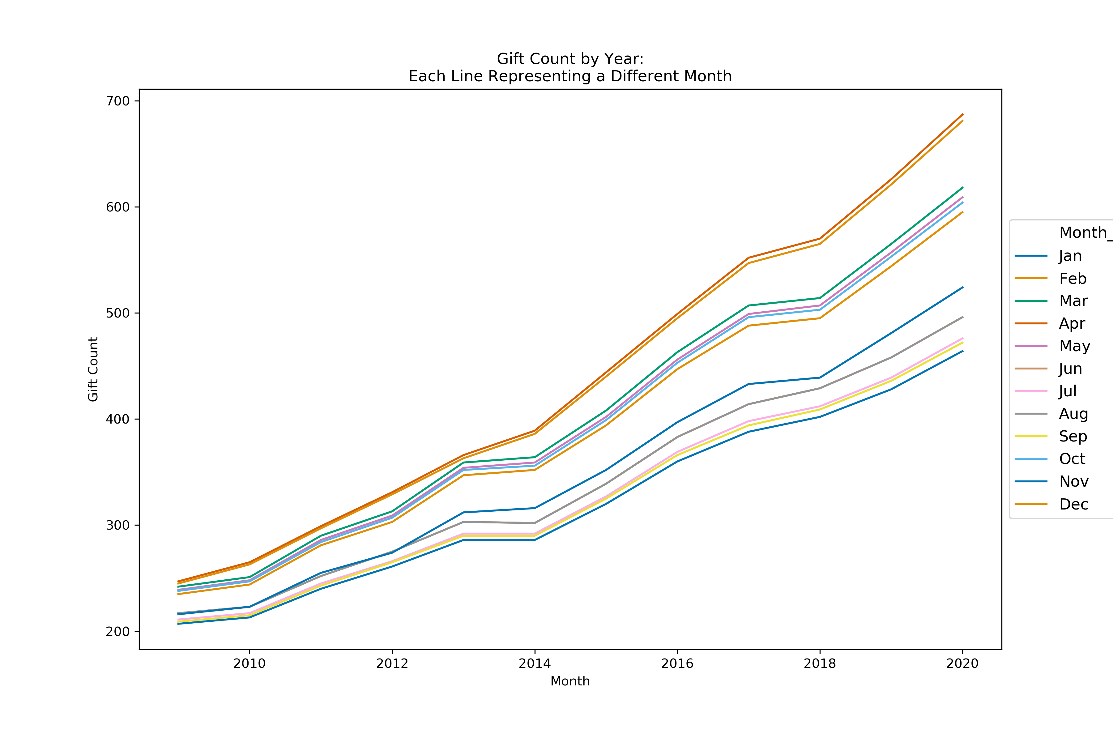
Still pretty hard to interpret anything. We can see that as the years increase, giving activity in each month also grows, but it’s very hard to distinguish which line corresponds to which month. We can start to see that the months could be split into three similar groups, but which months belong where is still a mystery.
Bar Chart
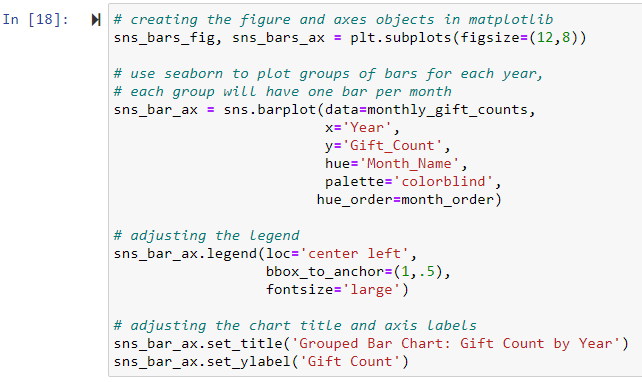
Another option that everyone is familiar with is a bar chart. Let’s try that. One of the great things about Matplotlib and seaborn is that they provide a consistent structure for creating visualizations. Our code for a grouped bar chart is very similar to our code for the line charts.
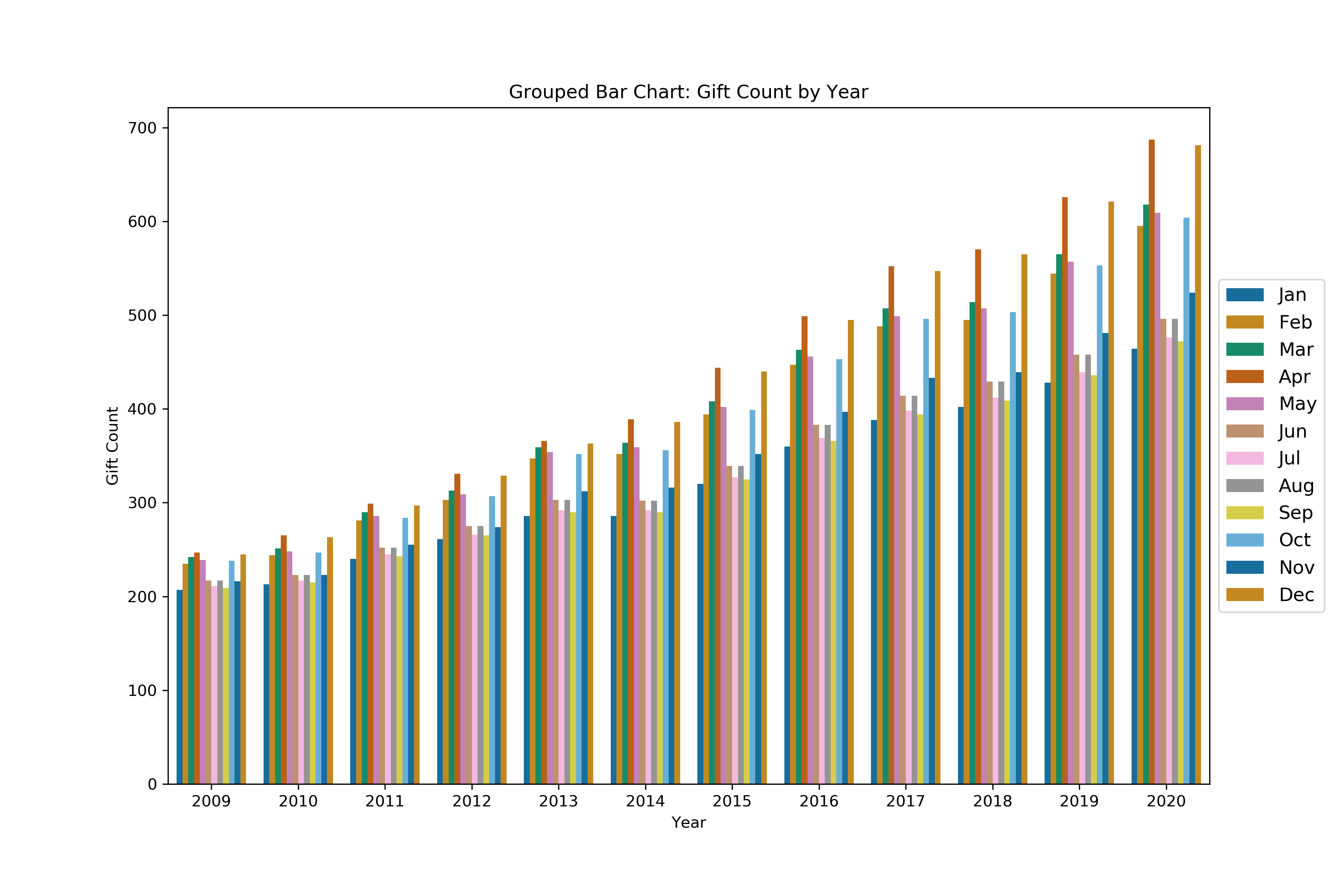
Again, we can see that the number of gifts has grown over the years, but just like the line charts, it’s basically impossible to determine how many gifts came in for any single month of a year. We have the same issue of 12 colors being too many to distinguish between. One possible remedy for this would be to look at 4 quarters rather than 12 months, but we would lose the detail that’s necessary to develop the best solicitation strategy.
Heatmaps
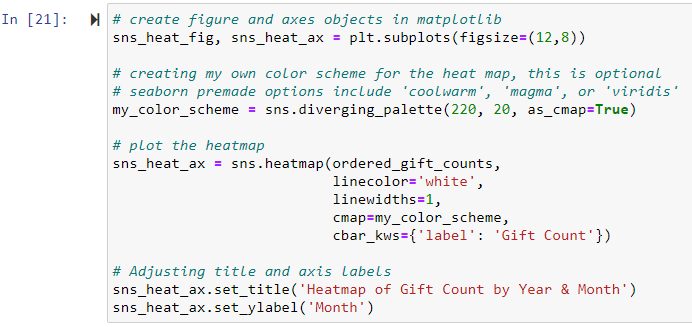
Our two most familiar visualization types are not working out. It’s time that we get a little creative and try a heatmap. Basically, we’re going to go back to our “wide” matrix layout from earlier and use color to help distinguish trends. You can accomplish the same work in Excel or Google Sheets using conditional formatting, but the result won’t look as professional as using seaborn’s heatmap. Creating a heatmap is as simple as calling seaborn’s .heatmap( ) function. In this example, I opted to customize the color scheme that my heatmap will use, but seaborn comes with several good options already preloaded.
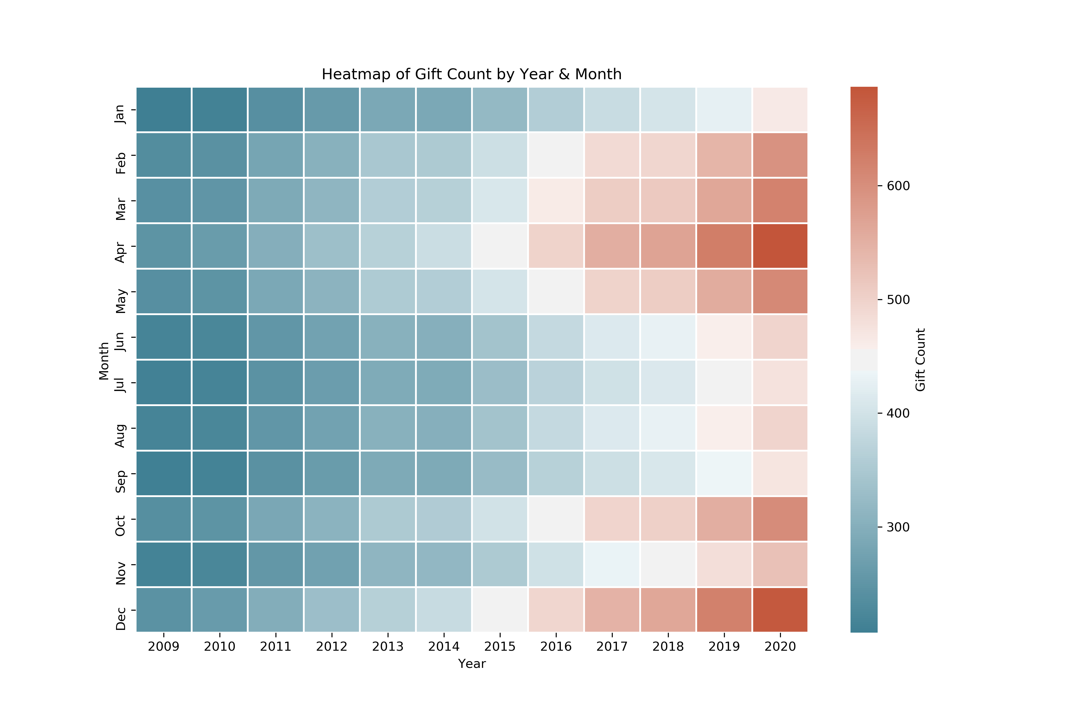
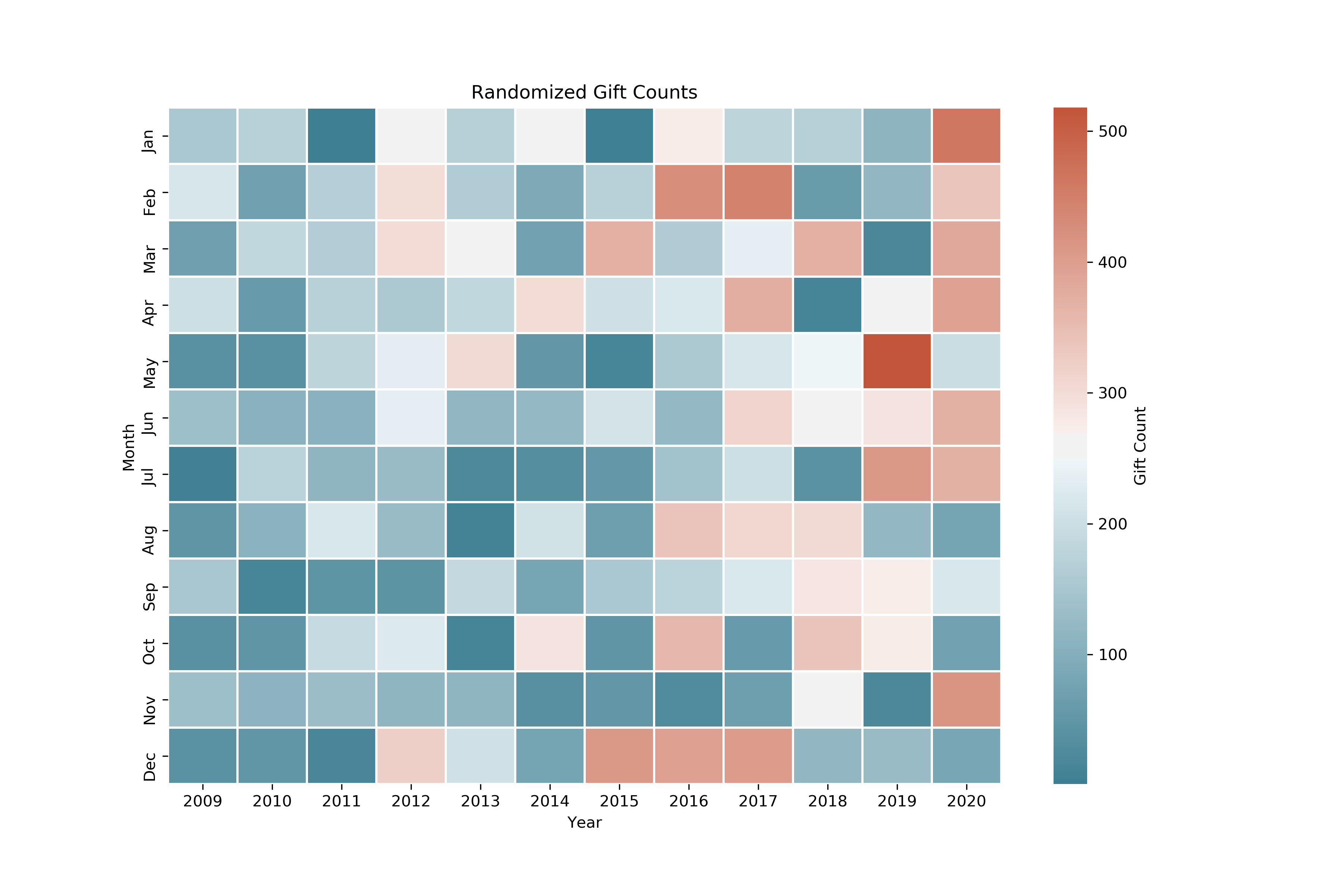
The heatmap turns our table full of numbers into a colored grid where each column represents a single year, and each row represents one month of the year. The color scale on the right tells us that blue squares have the lowest values and red squares have the highest values. Lighter blue, white, and pink squares make up the middle values.
With the heatmap, we’re able to see how giving to the Peabody Society has been trending over time across multiple scales of time. We can see that yearly, moving left-to-right, gift counts have been increasing since 2009 as we move from dark blues to pinks and reds. We can also begin to identify which months have seen the most activity. Moving from top-to-bottom, we can see that early spring and the end of the year seem to be the busiest times for giving in the Peabody Society, and that activity slows down in the summer. In particular, April and December show the most activity which leads me to believe that giving could be heavily motivated by the tax benefits of charitable giving. I would recommend that Wossamotta U focus on these months, and really emphasize that donations are tax-deductible in the language of Peabody Society solicitations.
October is also fairly red, especially when compared to its neighbors September and November. There could be an opportunity for a targeted solicitation here. Perhaps a Halloween-themed campaign for Peabody Society members with children could build on some strong October activity. It would be a mistake for the university to try and solicit during the summer months or in January as members are not active during those times. Using a heatmap allows us to zoom in to a specific year and month, while still being able to get the bigger picture of all 12 years.
A Caveat for Heatmaps
Heatmaps are pretty great, but they aren’t a prefect fit for every scenario. When would you not want to use a heatmap? If there is no discernable pattern or trend, a heatmap is not going to be very helpful. Let’s take a look at an example using random data. I’ll import the numpy library to be able to quickly generate random data for us to plot on our heatmap. Using pandas’ .applymap( ) function and numpy’s .random.randint function, we can replace every value with a randomly generated integer.

This heatmap is starting to resemble something created by Piet Mondrian. Don’t get me wrong, I love Dutch 20th century abstract art as much as you do, but right now we’re doing data analysis.
If your goal is to show that there is, in fact, no pattern in the data, then using this in a presentation or report might be useful. But, be warned that can be a risky gamble. When anyone looks at charts or graphs, they expect to be able to immediately identify the patterns and understand the key takeaways. If the takeaway of your visualization is that there is no takeaway… your audience may start to tune you out.
Conclusion
Heatmaps may not be as common as line charts or bar charts, but I believe they are easy enough to interpret, even for less data-savvy audiences. Additionally, as we saw today, heatmaps enable us to examine trends on both a micro and macro scale all in one visualization. For the Peabody Society, we were able to learn that their giving activity has been growing over the years, and that current members are most active in the spring and at the end of the year. Now, the leadership at Wossamotta U can move forward and develop a solicitation strategy that will capitalize on this behavior and avoid wasting time and money by asking when members aren’t giving.
Hopefully you found this helpful and are able to brainstorm ways that you can utilize heatmaps in your own work. It’s important to know your audience. If they are brand new to ideas around data analysis and new visualizations, maybe throw a simple heatmap into your next presentation and allow time for questions and explanations. If they are more comfortable looking at data in different ways, go ahead and explore swapping heatmaps in where you might have multiple line or bar charts.