How to Activate Your Heat Vision Powers

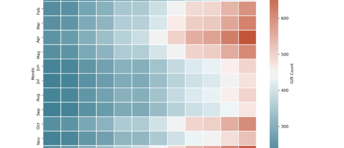
When it comes to data visualization, keeping it simple is usually the right approach. Line and bar charts are great for most use-cases. But sometimes you need more flexibility to show more data without making things too complex. Enter, the heatmap. Although less common than line and bar charts, heatmaps can strike the right balance between simple interpretation and depth of insights. This post explores a practical way to incorporate heatmaps into your next analysis.